Redesigning Rooftop app to improve learning experience

My Role
Sole UX Designer
Project Context
Personal Project
Industry
EdTech
Duration
4 weeks
Why redesign?
Learning an art form should be a memorable & fun experience. While exploring the Rooftop app, I found the content excellent and easy to understand. But, the learning experience from discovering art forms, learning about them, and exploring courses & workshops had some issues.
Results
Users found the redesign better & said "It's interesting, I would love to use it to learn about Indian art."
More users stayed longer on the redesigned app, hence increasing retention.
In a hurry, check the prototype:
Context
Rooftop is an Indian online learning platform
for live art workshops & professional art courses.
It helps bridge the gap between artists and art lovers - making Indian art easily accessible and approachable. It has more than 2,100 expert artists & 42k+ members present in 20+ countries across the globe. Along with teaching art forms, the app provides detailed information about different Indian art forms.
The target audience is people wanting to learn about Indian art. It can be a college student, a housewife, people doing jobs or any art enthusiast.
Problem
The content is excellent but presented in a boring way.
The app has many useful features like Art Wiki which provides detailed info about an art form & Inspire Me which provides interesting facts about an art form through the artist's voice notes. But these can be made more user-friendly. There are several opportunities to allow users to explore different art forms.
Proposal
Providing an immersive experience by using art form images & more interesting ways to explore art forms
Using images of the art was the simplest & most effective way to connect with the user. Because art enthusiasts love seeing the art forms up close. Even most users during user testing said they loved seeing those big & colourful images.
After analysing some flows in the app, I found some touchpoints where a user would want to know about an art form. This led me to improve existing features like Art Wiki, Inspire Me & add new ones like Art Identifier.
Research
Finding out how users learn traditional art forms.
I talked to some of my friends who are art enthusiasts asking them how they learn about traditional Indian art forms, here are some insights I found:
Some wanted to know how the art form started & what is its significance.
A user said she doesn't know many of the art forms but still she wants to learn them & learn about them.
I checked online reviews of the app to find what users are saying about the app:
“My favourite is the Daily App Quizzes. Loved it! Overall, the whole app is so fun to explore, especially the Inspire me (it will change how people consume art).”
“It helped me to gain detailed knowledge about different paintings and art forms. The best thing about this app is that the underrated artists of India are getting recognition by people.”
“The most fun and amazing part of this app is the quiz which tells us more about each art form every day. I really loved it's audio painting portion which describes the thought and process behind the painting.”
“An amazing platform for beginners to explore various art forms.”
After reading the reviews, I found that users like features like Quiz and Inspire Me, and they are exploring the app to learn about different art forms. With this in mind, I planned to improve these features without changing the goals of the existing ones.
Competitor Analysis
Other apps make learning interesting by engaging users through the projects they created.
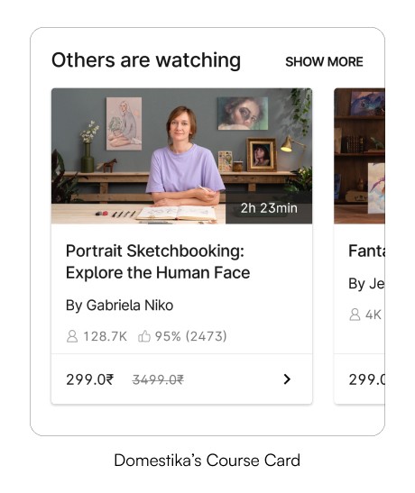
I checked some apps providing art courses & workshops like Skillshare & Domestika.

Brainstorming Ideas + Wireframes
How might we make the learning unknown art form experience fun for art enthusiasts?
I brainstormed some ideas to make the learning interesting. The ideas were very random but helped me think about it from a user's perspective which helped in creating wireframes.
I then created wireframes to provide all the necessary information for users to explore and learn about different art forms.
*For onboarding, I didn't create wireframes & directly designed hi-fi screens.
Here are all the flows that I redesigned:
Onboarding (Quiz included here)
Browsing art forms, learning their details & filtering them by state
Browsing courses & workshops and seeing their details
Identifying an art form
Learning about an art through voice notes (Inspire Me)
As I designed later, I continued to iterate on these wireframes. I didn't create wireframes for some of the additional features and designed them while I was working on the rest of the design.


Design
Building an onboarding that informs and excites
A great onboarding experience can increase customer retention by up to 50%, leading to higher engagement amongst users, but Rooftop may currently be losing out on some of that potential.
The current onboarding isn't reflecting the high-quality content of the app.
Here are some mistakes I found in the onboarding:
There's no info & images about art forms or the artists. It says very general things. There's an opportunity here to engage users by mentioning the app's USP.
There are extra steps a user has to go through to finally see what they are here for - the art forms & workshops/courses.
There's no need for the Signup screen as the user has already created their account using OTP verification & adding their details can be done later.
The following screens where the user has to choose an option don't serve any purpose other than collecting data about the user (I assume). There are no recommendations/personalization to the user based on their answer to these.


All the colourful art forms with the dark mode give an immersive experience & also easy on the eyes, so I kept the UI in dark mode too.
Here are some designs I started with:
*I thought of allowing users to pick a few art forms and then showing them recommendations based on their choices. But, I realized that this might not be a good idea because there are so many art forms to choose from, and it's difficult for users to make informed choices when they may not be familiar with all the options.

My goal was to create a memorable and delightful experience.
In the redesign, I skipped the extra steps and used high-quality images of art and artists to build trust and authenticity. For curious people who want to know about the images used, I added small chips mentioning some info about the images used.
Drawing inspiration from India's tradition of hospitality, I recreated the welcoming aarti and garland tradition by using a Kalighat art painting. It's warm, inviting, and joyful.
I picked the colour yellow for the brand to show happiness, energy, and joy, similar to the feelings art brings. This helped me keep a consistent visual direction for the brand.

Simplifying the homepage by prioritising important info at top
I noticed that some of the features in the current home are not being used properly. Here are some issues I found:

*The app got an update of the top banner at the time I recorded.

Too much scrolling
No clear organisation of courses & workshops
Subscription banner can be made more appealing
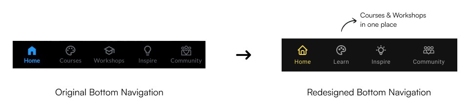
Firstly, I redesigned the bottom navigation by adding the brand colour, making the inactive tabs more accessible by using a high-contrast grey. I combined courses & workshops under one tab named 'Learn' so users can go to a single tab to learn & switch between what they want to join.
SOME EARLY ITERATIONS
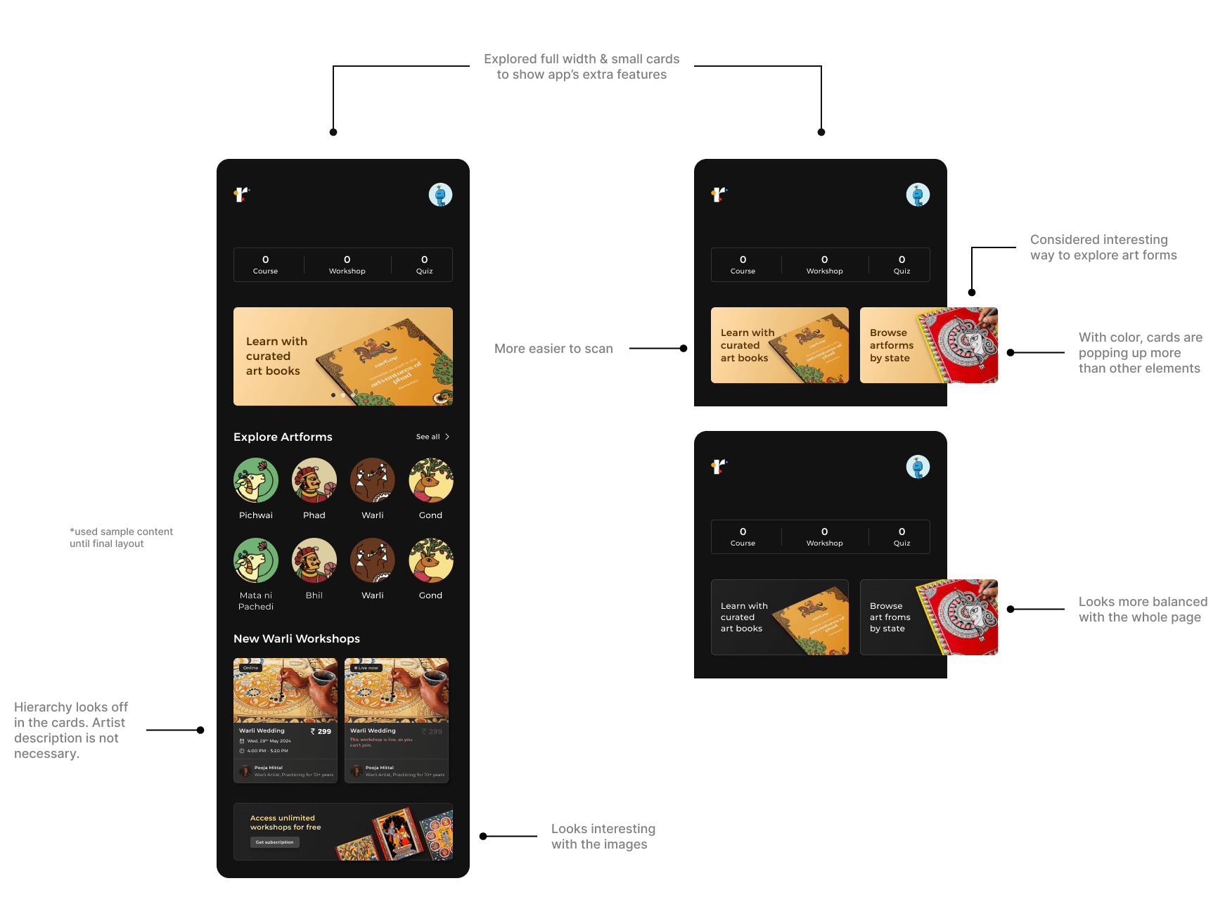
When I was designing Home, I continually took feedback from users & iterated based on it.
One significant change I made was in the placement of the art identifier. Initially, the art identifier feature was placed along with the two cards on the top. But, placed it along the profile icon at the top after user feedback.
Minakshi
Why it’s hidden in the cards, it should be more visible - somewhere at the top, so that we can quickly use it.

While considering the option to browse art forms by state, I thought I could integrate this feature more seamlessly into an existing flow. I found it would be more effective to place this feature within the filters that users see when seeing all the art forms instead of putting it in the cards on top. This way, users can filter out the art forms more effectively.

Browse
art froms
by state

Filtering art forms by state on the "See All Art Forms" filter screen is much easier to use.
I also added an option for users to view art forms from a specific state on the map, making it more fun.

FINAL HOME DESIGN
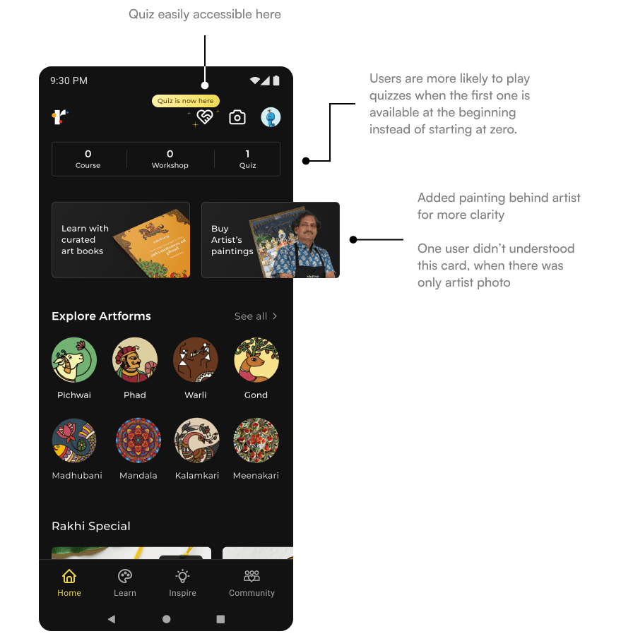


Users liked the new homepage design, especially the colourful images used & Rakhi Special category. But most of them said they didn't understand the quiz icon & said…
"I don't know what this icon is about, I know
it's a quiz because the text says 'Quiz is now here'."
So changed the icon to say Quiz which is easily understandable.

Making courses & workshops flow accessible & interesting
I noticed some issues in the existing app's Courses & Workshops screen, along with some positive aspects. The main issues I observed are: not using art form images in focus and not showing the price on the course & workshop cards.
Images are important for people deciding whether to join the course or workshop. Since most users are unfamiliar with these art forms, seeing the images is the only way they can decide if they want to learn more about them.
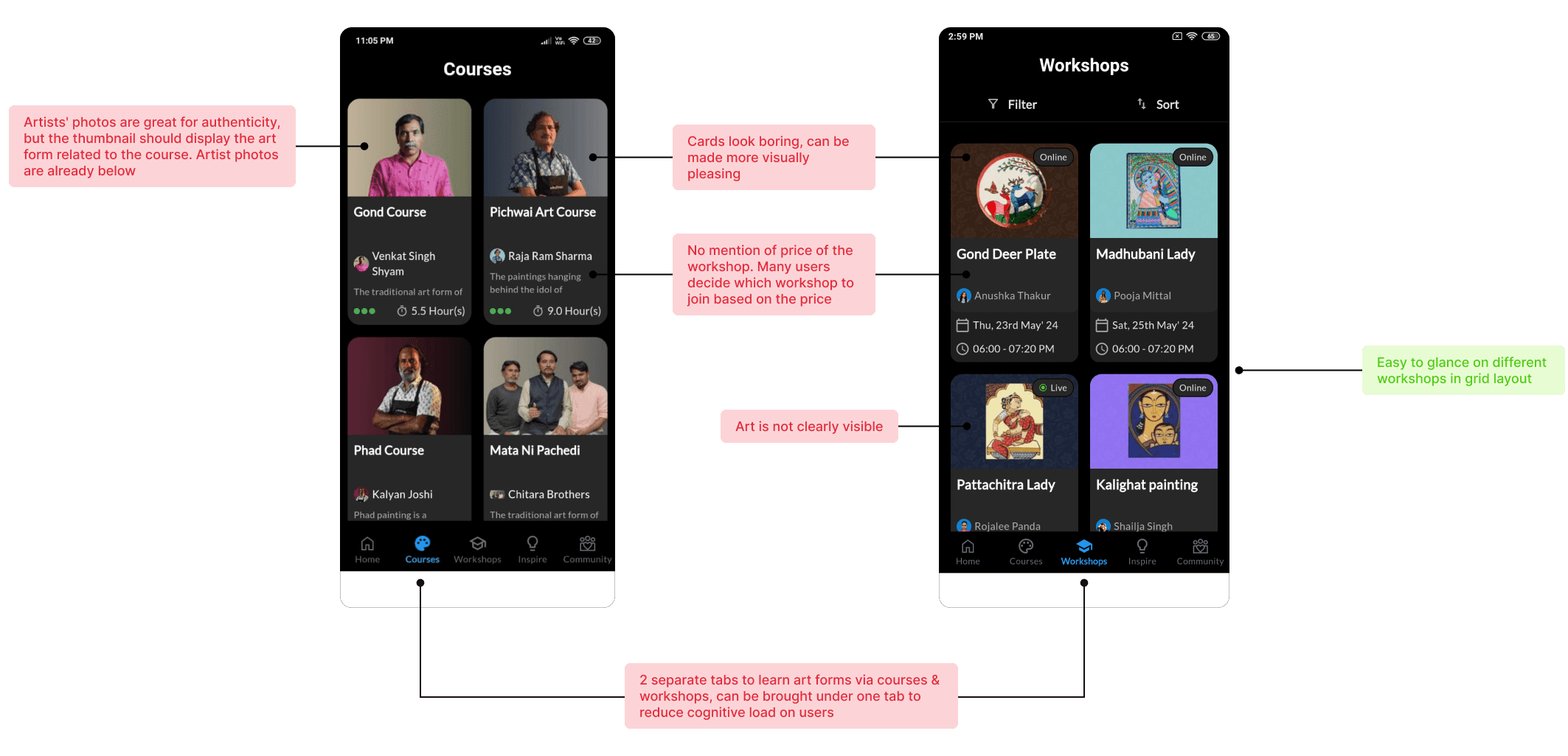
While designing the cards, I analyzed how other apps display information. People often decide based on price, which wasn't initially shown in the existing app. Including the artist's photo was important for authenticity.
For courses, it was important to show the duration and number of lessons, while for workshops, it was the date and timings.
When I was working on the first design for this flow, I showed it to some users for their feedback. I received two different perspectives from users:
One user found seeing small details on the cards difficult and felt overwhelmed by the number of cards displayed at once.
Another user appreciated viewing four cards simultaneously, allowing them to compare different courses/workshops quickly.
SOME EARLY ITERATIONS

FINAL DESIGN
After trying out different card sizes and layouts for displaying information in a way that's easy to understand and has a good hierarchy, I decided to go with these designs.
Continuously collecting feedback from users and showing them this design has helped me to get new ideas and design in a way that makes sense to them and is easy to navigate.

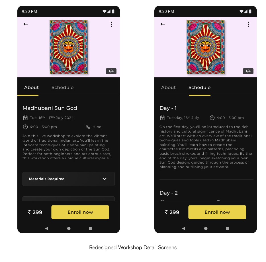
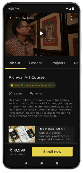
I redesigned courses & workshop detail screens keeping the important info at the top & making it interesting to read by organising information into different sections.


Text barely visible
No mention of
course price


Looks boring
Original
Redesigned

y organising information into different sections.
Bringing engagement to the app through redesigned community
The current community lacks a way to connect and comment on each other's projects. I like the interaction in the Skillshare community, where you can discuss projects, exchange ideas, and connect with like-minded people.

There are two ways to increase user interaction & thus engagement:
Through the community itself
Clear CTA to
upload projects
Added must have controls -
like & comment to bring community interaction
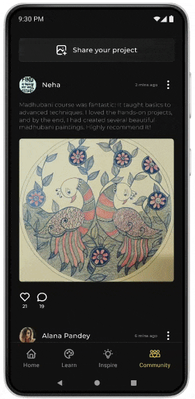
In the courses where learners can upload their projects, view others' work, and take part in discussions
(Not workshops, because a workshop happens live and changes each time; it does not stay fixed on the app like pre-recorded courses. Once the workshop has ended, the workshop card will be removed.)
Making Inspire Me visually interesting & aligning on brand visual
From reading user reviews I found that users liked this feature. With the redesign, my goal was to make it more beautiful & interactive yet keep the same structure as original.
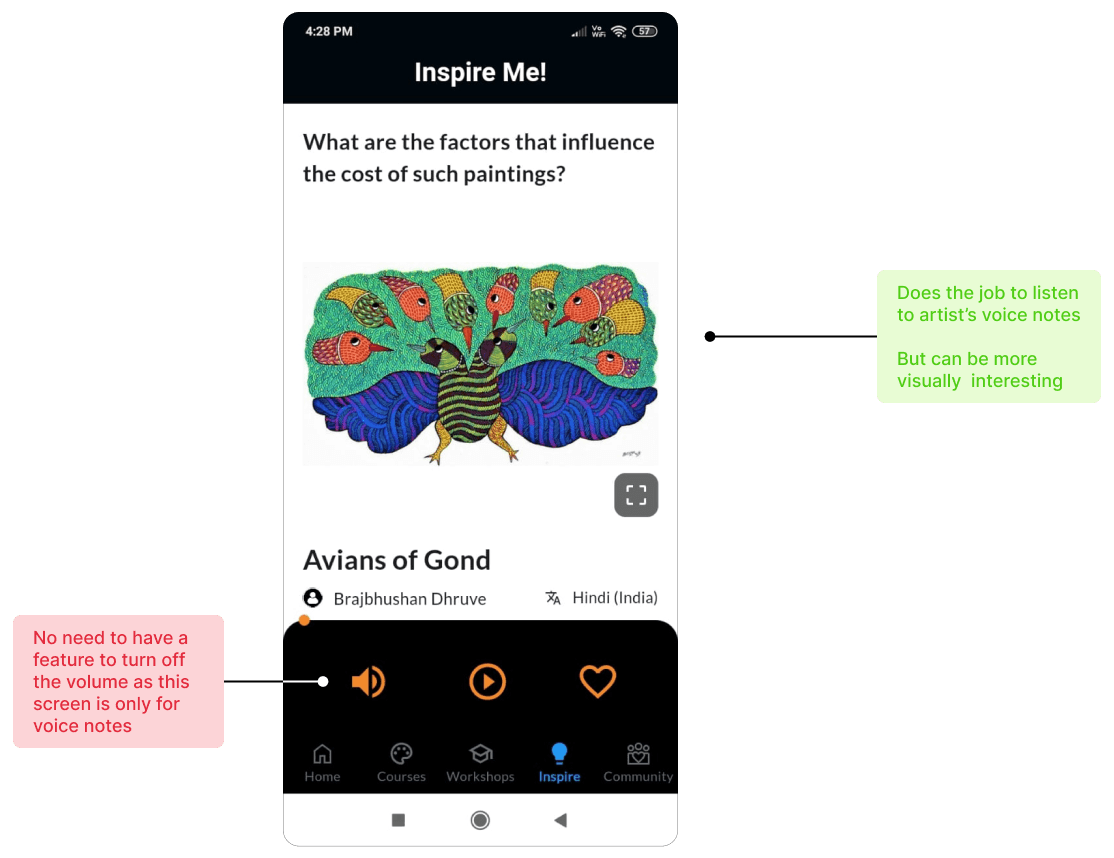
I used cards for each question as it is more easy to understand & scan.
Added some text to explain what this screen is about for first-time users
Added a play button on the cards so users can identify the playing card while scrolling through others
Helps users rewind and forward voice notes, and adjust the slider to the part they want to hear
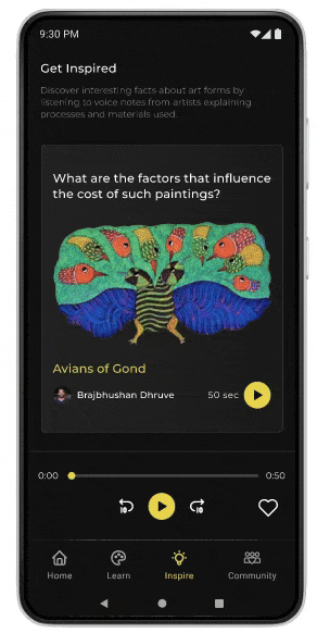
Created hierarchy using colors & font size in card
When I tested the design with users, they liked the design interactive & fun - a user said…
Making it easy & fun to explore & learn different art forms
After reading online reviews, I found that many users are unaware of these art forms and want to learn more about them. This got me thinking...
How might we make exploring & learning
unknown art forms easy & fun?
After brainstorming some ideas and analysing the existing app features & flows that allowed users to explore, I found some flows & features that could be improved.
*I changed the Quiz icon later that's why the updated icon is not showing here.
Art Form Detail
From talking to users, I found that they want to know everything about an art form, like its origin, cultural significance, how it's made, where it's used, and the elements involved.
The current page has too much text, which makes it boring to read.

To fix this, I added tabs at the top with categories like Intro, History, Understanding the Art Form, and New Outlook with supporting images in each. This way, users can quickly scan and tap on what they want to learn about.


Art Form Identifier
The idea is that we often see different types of art in our daily lives, such as murals, houses, and home decor products. Art enthusiasts notice these details and are curious to learn more. This is where I thought of adding this new feature. It allows users to identify the art form and access details about it.
This is different from Google Lens because it provides all the important information within the app itself and also shows the available courses and workshops, making it more convenient.


Did You Know? (redesign of existing Art Wiki)
The existing Art Wiki had its negatives and positives:
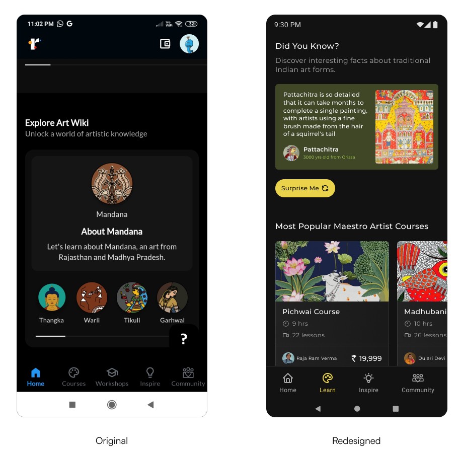
To make Art Wiki more interesting and different from the "Explore Artforms," I thought of adding short, interesting facts about art forms along with a photo of the art form and some details.
I changed the name to "Did You Know" because it makes users excited to see what they don't know. This uses users' curiosity and also teaches them something they didn't know before. Having only one fact seemed unengaging, so I added a button that said "Surprise me." When tapped, it will show another fact.
Upon showing it to users, they found it informative saying…
"I didn't know that before, I want to
know more about these art forms"
Quiz
Quiz was also an opportunity where in an interesting, fun & gamified way - the app could teach something to users about art forms. The current quiz is boring &


Original
Redesigned
With the redesign, I kept it fun & engaging. When users choose an option (correct or incorrect) the app tells them a bit more about the correct answer & encourages them to read more about it.

User Feedback
Users liked the redesign saying it was fun & interactive to use.
I tested the designs with some users asking them how is their experience exploring art forms on this app & if it's easy to understand.
Most of them said they found it easy to use & was quite understandable. They loved those colorful art form images, making them stay longer on the app.
Learnings