Designed a fitness app to provide accountability to users in their fitness journey
FitFam is an app that enables users to create and join fitness challenges with their friends & family. My goal was to design an app that provides accountability to people & helps them be consistent with their fitness routines.
Sole UX Designer
Project Context
Personal Project
Fitness
2 weeks
Challenge
People face a lack of motivation & inconsistency in their exercise routines and healthy habits, especially when they are doing it alone.
Results
The designed app features a clean, clutter-free interface, making it easier for users to navigate and access essential features like joining a challenge.
35%
Improved onboarding process
25%
Increase in user retention
In a hurry, check the outcome first
With this question in mind, I conducted interviews with people who struggled to maintain healthy habits to gain insight into their experiences & discover ways in which it could be improved.
I found these two themes common in all my interviews:
Accountability
Alone is Boring
Based on the research findings, we restructured the app's navigation and content, prioritizing features and information according to user needs.
Current user behaviour
Deciding to exercise
Planning
Exercising
Tracking progress
Losing motivation, more likely to stop exercising
Proposed solution
Deciding to exercise
Joining an exercise challenge
Logging progress
Competing with friends & family
Increased motivation, more likely to continue exercising
I chose Leaderboard so users can see how well everyone is doing in a challenge and feel inspired to do better. I chose Account so a user can quickly get access to their account details, add a new device to track activity or create their own challenge. These will be the primary actions for the user.

Creating wireframes
I sketched out some sketches to get my ideas in functional design.
Designing high-fidelity designs
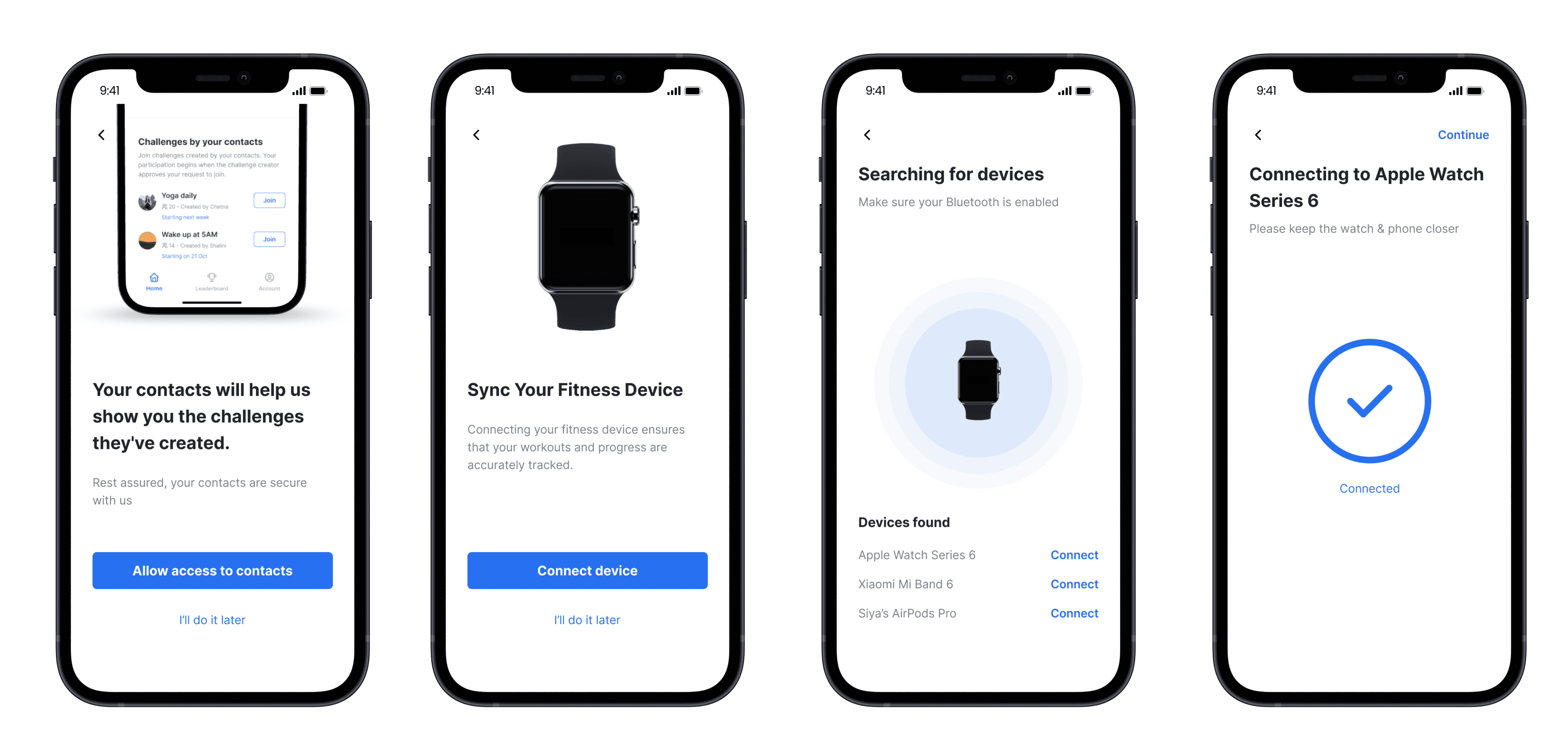
Creating an easy onboarding
The first time people use the app, they just want to start using it without thinking too much. So, the onboarding process should be simple and not make them give up. I made sure it was straightforward and only included what was needed.

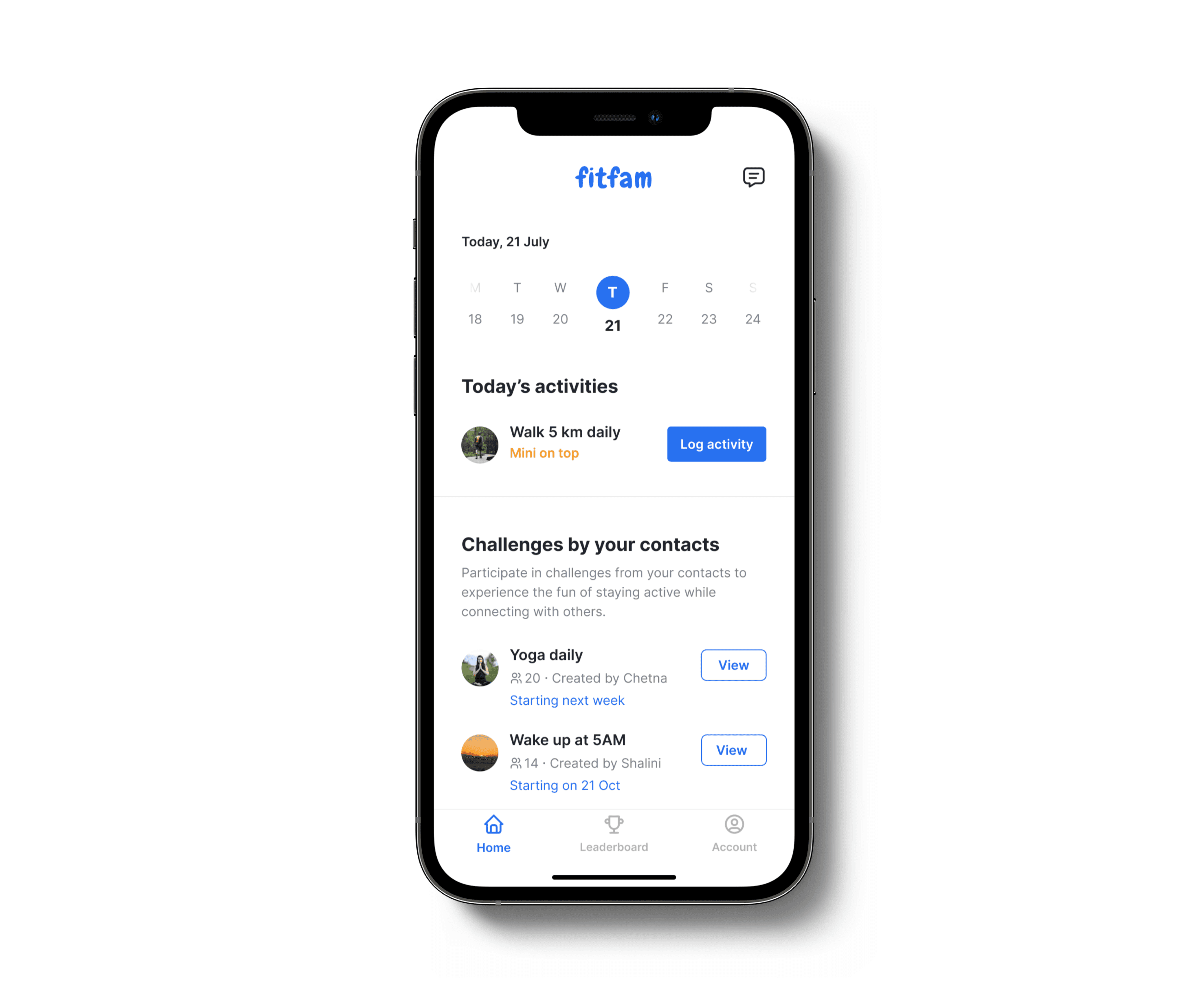
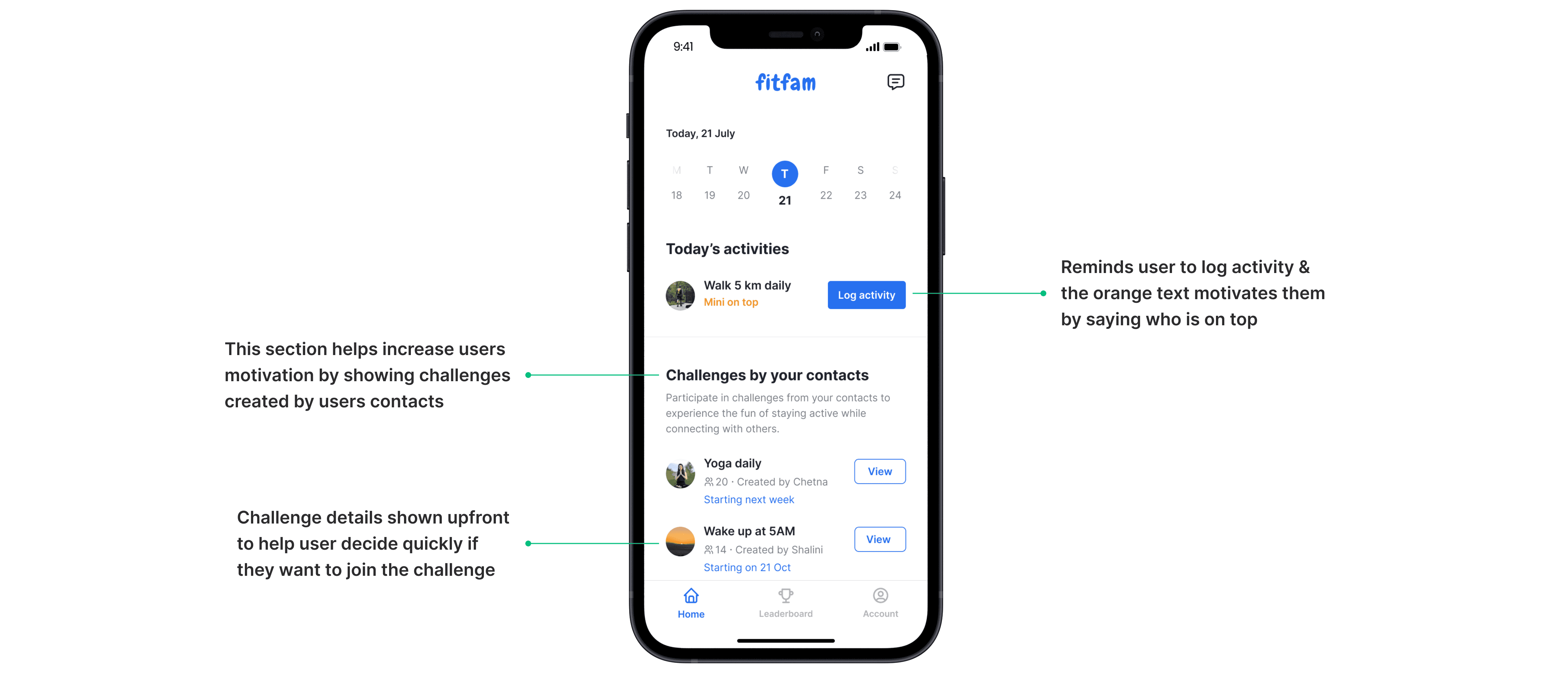
Designing the home screen
After users sign up, they will see this screen. I wanted this screen to give users a quick snapshot of what's happening. It displays new challenges created by user's contacts and reminds users to log their activity.

Here's why these 2 iterations didn't work out:
The calendar icon was added to friction
There was no primary focus on the screen
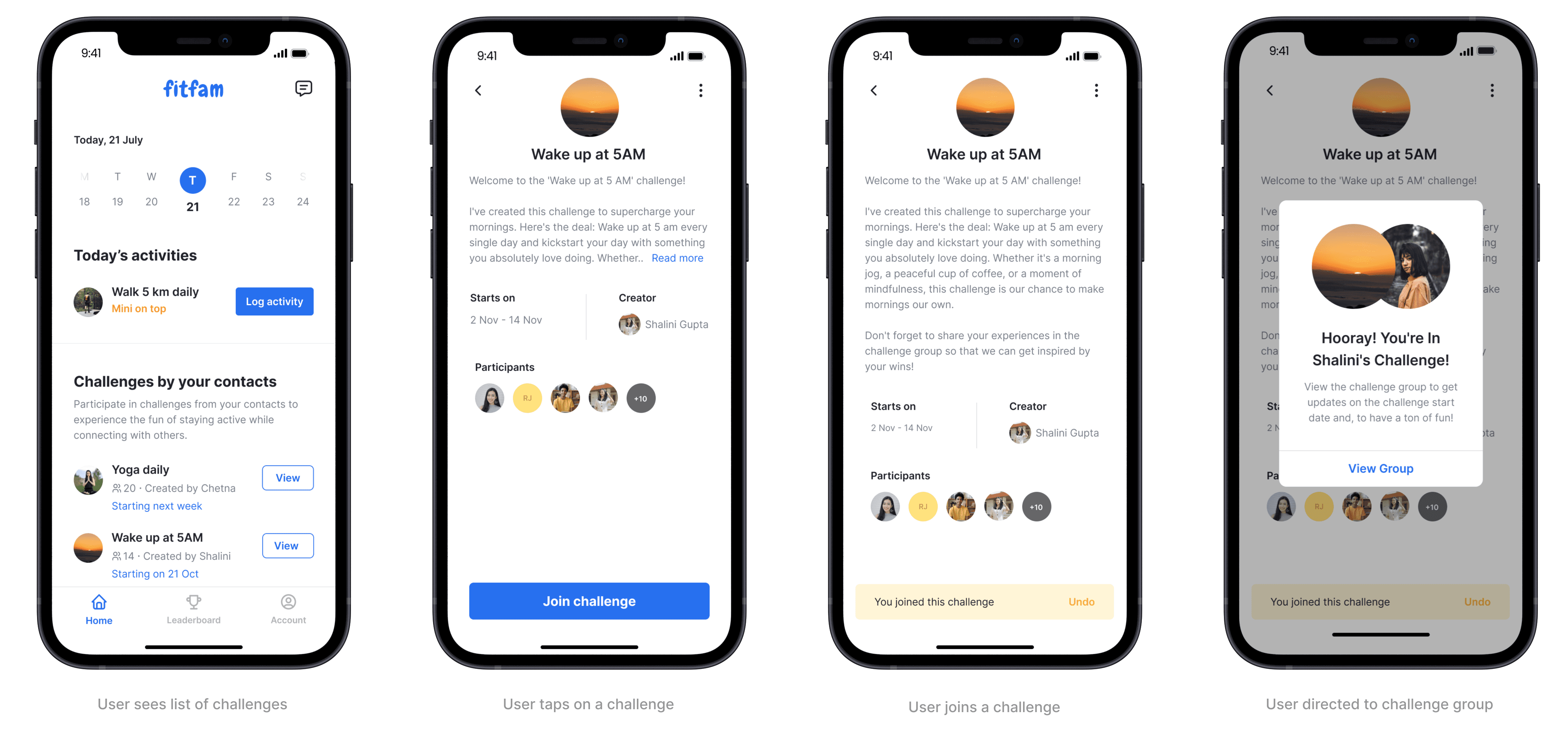
Joining challenges
As easy as it sounds, joining a challenge should be quick & easy. I made sure it was as easy as following someone on Instagram - just a click & you follow the person!
For someone to join a fitness challenge, it is important to show the details of the challenge so they can make an informed decision. No one wants to join a challenge without knowing what they're getting into, right?
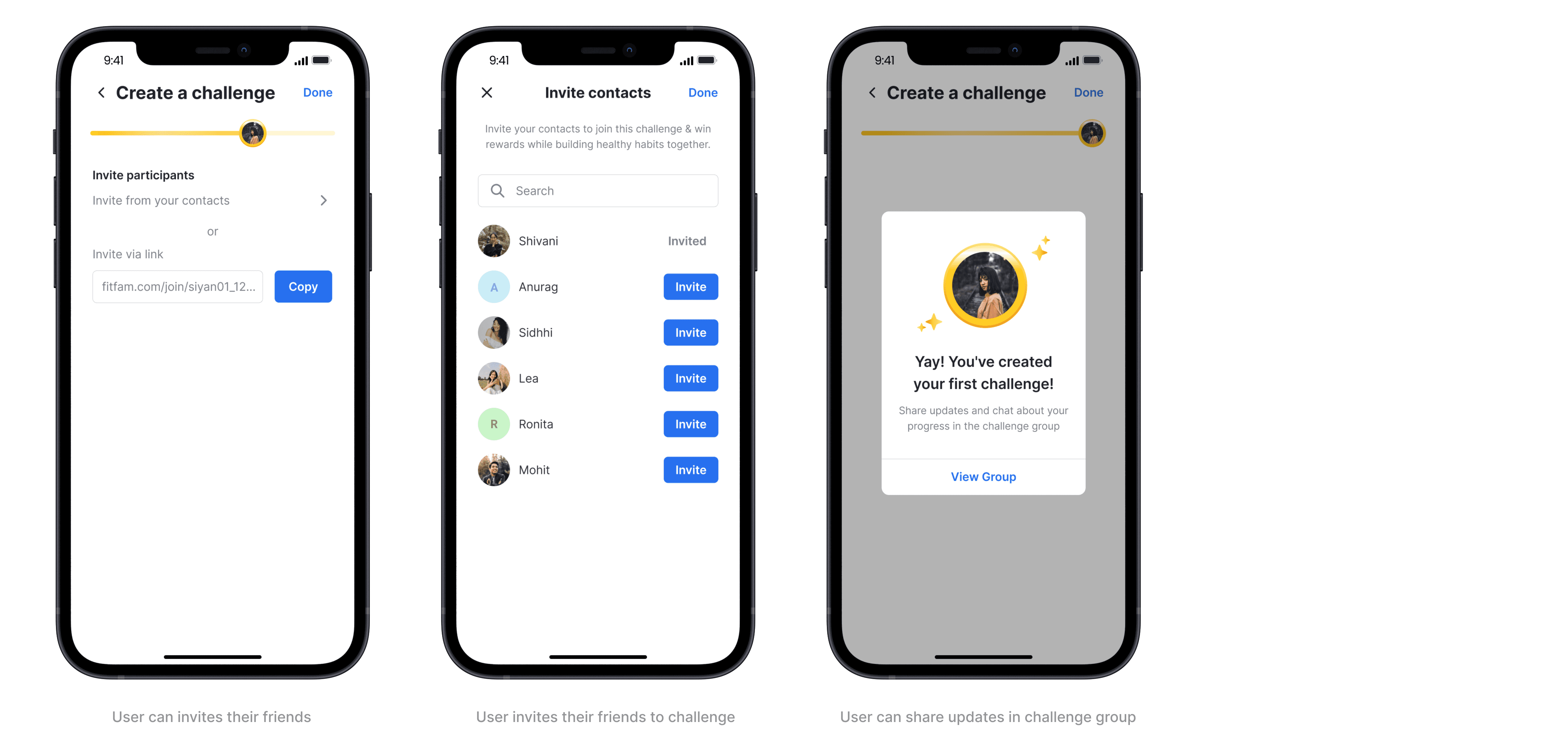
Creating a challenge
I understand that creating a challenge may not be a frequent activity for users, so I have placed this feature under the account page to avoid cluttering the main interface.
The UI for creating a challenge is simple and clean, to ensure that users can focus on the primary task. Additionally, users can invite others to join their challenge. Once the challenge is created, the app will direct the user to a dedicated group, where the creator can share updates and communicate with the participants.